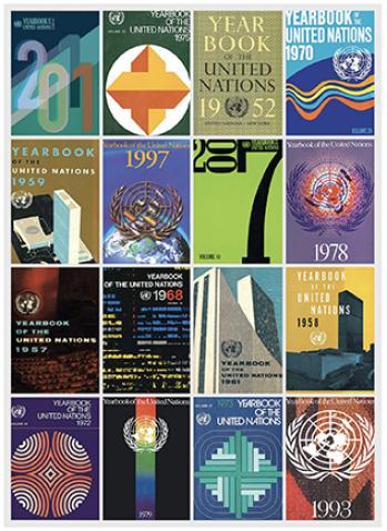
The Yearbook of the United Nations has served as the Organization’s flagship reference work since its inception, and looking back at the illustrated Yearbook dust jackets provides a unique perspective on more than 60 years of developments in visual design. These covers have regularly reflected the culture of their time, while alluding to the wealth of information on UN activities and concerns contained within each volume.
The earliest Yearbook dust jackets were fairly conservative, often depicting little more than the United Nations logo and the title of the book.
Designs of the late 1950s came to employ a minimalistic illustrative style often seen in art and advertising of that period. The ensuing decade witnessed a transition to neon colours and kaleidoscopic patterns that evoke the psychedelic mood of the day. With the advent of the 1970s, Yearbook dust jackets began to feature geometric shapes, testifying to the influence of Optical Art. This artistic movement, associated with Gestalt Theory, maintains that the whole is greater than the sum of its parts—an appropriate concept for the United Nations at any point in its history. The next ten years brought pixelated imagery to the cover designs, highlighting the growing global influence of computers. There followed in the 1990s the predominance of photographic covers—perhaps a direct result of the commercial release of desktop photo production software.
The 2007 Yearbook ushered in a new look by introducing a purely typographical design, with numerals visually defining the volume as a reference work for that specific year. The 2008 cover augmented this approach through the addition of a 'word cloud’ incorporating terms indicative of major UN consideration and action. The 2009 design likewise typographically highlights the year in question, but employs a three-dimensional form to suggest a framework itself symbolic of the UN system architecture. 2010 was a milestone year for the United Nations in its work, as the year saw the High-level Plenary Meeting on the Millennium Development Goals and the creation of UN-Women. The 2010 dust jacket design (a winner at the 2015 American In-House Design Awards, Graphic Design USA) incorporates these elements, suggesting, on one hand, the dynamic structure informing the efforts of the Organization towards achieving the Goals and invoking, on the other, the Venus symbol informing the visual identity of the new United Nations entity for gender equality and the empowerment of women.
The dust jacket of the 2011 Yearbook attempts to convey something of the turbulence of that year—from the humanitarian crisis generated by civil conflict in Syria to the Fukushima Daiichi nuclear power plant accident in Japan—by employing a darker colour scheme than that used in previous covers, and by using unaligned numerals to imply the uncertainty surrounding the final outcome of those events. There is, however, some light refracted through the numerals—a prism effect evoking the promise of hope that drives the work of the United Nations. Given the turbulent global humanitarian situation in the year 2012, shapes in the corresponding Yearbook dust jacket design are meant to depict a sense of monumental transition. The eye follows the shapes to see a mechanism in action, although there is no clear path ahead. These transitions occur against a light ray of hope for the future background. Earthtone colors in the numbers and shapes symbolize the connection of living beings to the Earth, tying into the environmental issues addressed in 2012, especially the United Nations Conference on Sustainable Development (Rio+20). Warm burgundy is used to evoke vigilance, grays as a color of compromise: elements needed for the United Nations to navigate through the year.
In 2013, international migration remained a concern, with 51.2 million persons being displaced by conflict and persecution. The corresponding dust jacket design, with a background in two shades (dark blue and dark beige), represents an extensive sea and a foggy sky, evokine the uncertainty in which thousands of people ventured each day in search of a more promising future. The number '2013', in two very vivid and intense shades of orange, symbolises life, hope and international efforts, including those of the United Nations, to help all persons who were forced to leave their homes to rebuild their lives in an environment free from conflict and crises. It also exemplifies the courage of people who put their lives and families at risk to improve their well-being, quality of life and employment situation; to ensure the health and education of their children; or just to survive.
The cover for the 2014 Yearbook portrays the impact of climate change due to global warming—an increase in the temperature of the earth’s atmosphere and oceans—that is generally attributed to greenhouse gas emissions from human activity. Against a white background representing ice (Arctic or Antarctic), a myriad of small cracks reveals the blue sea underneath. A larger crack runs toward the number 2014, where the orange-filled zero symbolizes the sun—a source of joy and strength for life on our planet, but whose heat can also adversely affect us. The year 2014 was one of the warmest on record. The United Nations is working for short- and long- term solutions to global warming; but everyone needs to be involved in meeting this existential challenge.
In September 2015, United Nations Member States unanimously adopted the 2030 Agenda for Sustainable Development. The 17 sustainable development goals (SDGs) included in the 2030 Agenda are symbolized in the roulette featured in the cover design of the Yearbook of the United Nations, 2015 inspired by that action. The coloured wheel represents progress—here the political will to improve the lives of everyone everywhere. The surrounding orbital paths suggest how our world is interconnected in a system of environmental, social, cultural, economic and political interaction. Our responsibility as human beings is to understand the fragility of the system and to exercise proper care inasmuch as our actions and decisions have consequences—already in grave evidence—that affect every living thing. Clockwise from the bright red field in the upper right of the roulette, the seventeen colours represent SDG1: No poverty; SDG2: Zero hunger; SDG3: Good health and well-being; SDG4: Quality education; SDG5: Gender equality; SDG6: Clean wate and sanitation; SDG7: Affordable and clean energy; SDG8: Decent work and economic growth; SDG9: Industry, innovation and infrastructure; SDG10: Reduced inequalities; SDG11: Sustainable cities and communities; SDG12: Responsible consumption and production; SDG13: Climate action; SDG14: Life below water; SDG15: Life on land; SDG16: Peace, justice and strong institutions; SDG17: Partnerships for the Goals.
Whether or not all 69 Yearbook cover designs were intentionally styled to reflect the times in which they were produced, they clearly show the influence of contemporary culture over the nearly seven decades of UN history. It remains to be seen how the world's ever-changing visual vocabulary will leave its mark in future Yearbook cover designs.